5 Essential Brand Photos That Actually Drive Conversions
The 5 Essential Photos Every Brand Needs (And Why Most Are Missing at Least Three)
You've invested in a website. You've refined your messaging. You've even hired a copywriter to nail your About page. But when potential customers land on your site, they're still bouncing—and you can't figure out why.
Here's what most brand managers, founders, and marketing directors miss: people don't read their way into trust anymore. They feel their way in. And if your visuals aren't answering the questions your audience is asking before they even realize they're asking them, you've already lost the sale.
This isn't about having "pretty pictures." It's about having the right pictures—the ones that translate your vision into proof, your promises into evidence, and your brand into something people can actually feel through a screen.
After years of shooting for brands across commercial, editorial, and branding spaces, I've identified five foundational photo types that separate the brands people scroll past from the ones they stop for, remember, and ultimately choose. These aren't luxury add-ons. They're strategic necessities. And if you're missing even one, you're leaving conversions on the table.
Let's break down exactly what these images are, why they work, and how they transform skeptical visitors into confident customers.
1. The Founder/Team "Why We Exist" Portrait
The Problem It Solves
If you're a founder or team leader struggling to differentiate in a crowded market where everyone claims to be "passionate" and "dedicated," you're facing a credibility crisis that words alone can't fix. Your competitors are saying the exact same things you are. Your mission statement sounds like everyone else's. And in that sea of sameness, your audience has learned to tune it all out.
This portrait solves that problem by putting a real, relatable face to your mission. It's not another corporate headshot with a fake smile against a gray background. It's the visual handshake that tells your origin story without saying a word—the image that signals to customers that there are actual humans who stand behind your promises, who care about the work, who exist beyond the logo.
What Makes This Image Work
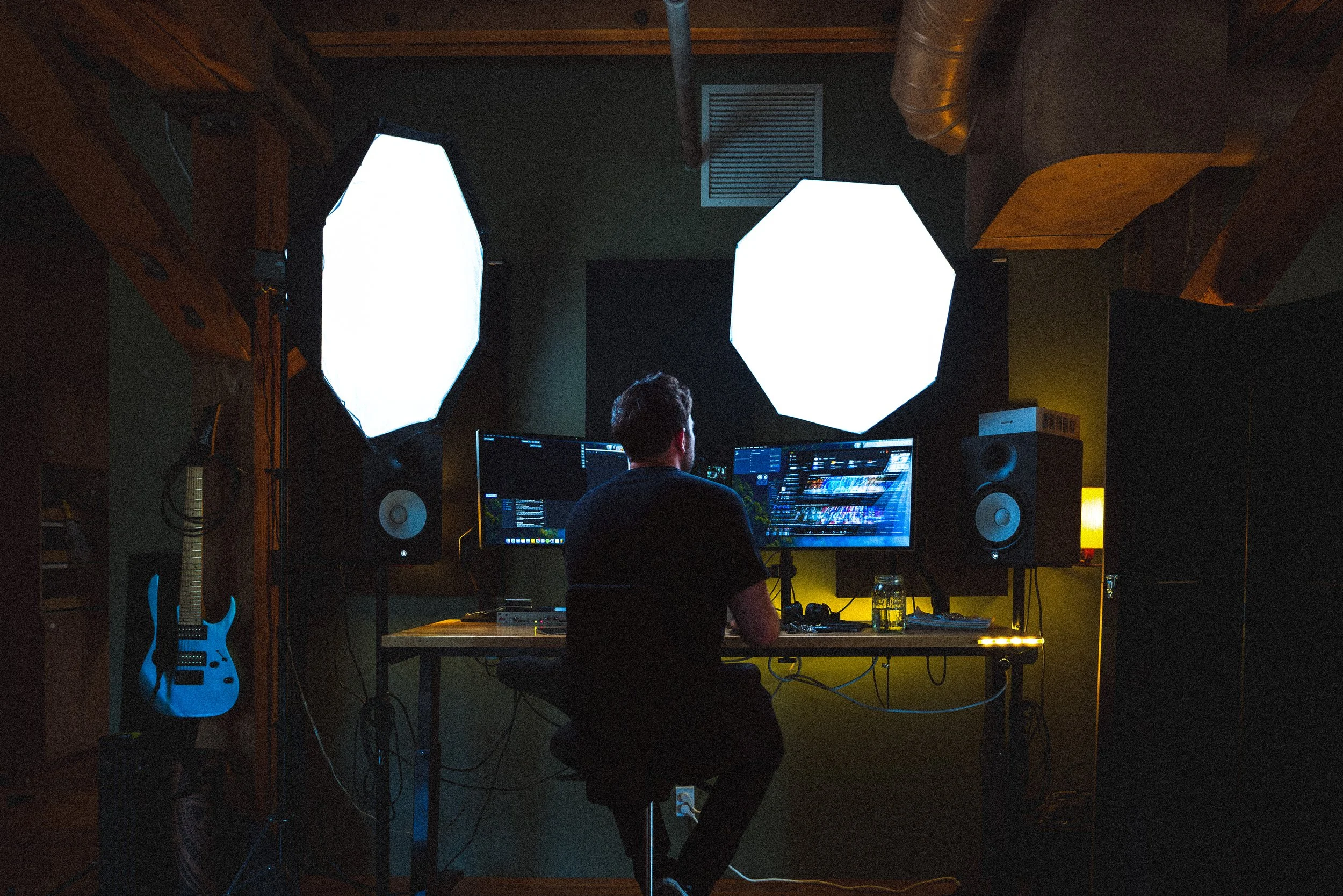
Environmental context that reveals your working reality: Your studio, office, workshop, or field becomes part of the story
Authentic expression that conveys approachability rather than corporate stiffness: Real emotion, not manufactured professionalism
Strategic composition that balances professionalism with personality: Credible but human
Lighting that creates warmth and dimensional depth: You feel present, not flat
Background elements that subtly communicate your values and process: The details tell the deeper story
How This Plays Out in Real Life
Consider Maya, founder of a sustainable activewear brand competing against giants with million-dollar marketing budgets. She was drowning in the noise of "eco-friendly" claims that every competitor was making. Her About page copy was strong, but people weren't connecting. They'd land on her site and leave within seconds.
Instead of another sterile white-background headshot, her photographer captured her in her design studio at golden hour. Maya was surrounded by fabric swatches and pattern sketches pinned to the walls, hands gesturing mid-explanation about her zero-waste cutting process. She wasn't posing—she was in it, explaining the work she actually does. Natural light streamed through the warehouse windows, creating this authentic, almost documentary feel that made you feel like you'd just walked into her space uninvited and caught her doing what she loves.
The background wasn't styled for the camera. Her tools were visible—rotary cutters, measuring tape draped over her shoulder, fabric scraps she'd later use for sample pieces. You could see the actual work happening, not a sanitized version of it.
When Maya placed this image on her About page above the fold, the shift was immediate. Her average session duration increased by 43%. Her email signup conversion improved by 28% within the first month. But the real indicator was qualitative: customer feedback consistently mentioned "feeling like they knew her" before even placing an order. People would email saying they bought from her specifically because they could see the person behind the brand—and that person felt real.
The photo didn't just show who she was. It made visitors feel the passion driving her brand's existence. It answered the unspoken question every customer has: "Can I trust this person with my money?" And the answer, captured in a single frame, was yes.
2. The Product-In-Context "How This Fits Your Life" Shot
The Problem It Solves
If you're an e-commerce manager watching cart abandonment rates spike, the culprit might not be your pricing or your product descriptions. It's that your customers can't visualize how your product actually works in their daily reality. They're staring at perfectly lit white-background catalog shots that show what something looks like, but those images are failing to answer the more important question: "What does my life look like with this?"
That imagination gap is where sales go to die. People need to see themselves in the frame—not literally, but contextually. They need to feel the moment when your product becomes part of their routine, their ritual, their identity. Lifestyle context shots bridge that gap by translating product into experience.
What Makes This Image Work
Real-world environment that matches your target customer's lifestyle: Not a studio, but their kitchen, their office, their actual life
Natural interaction showing actual use: Not forced poses, but real hands doing real things
Complementary elements that suggest the broader lifestyle your product enables: The details that say "this is for people like you"
Depth of field that keeps focus on the product while providing environmental context: You know exactly what you're looking at, but you feel where you are
Lighting that feels native to the setting: Morning light through a window, not obvious studio strobes
How This Plays Out in Real Life
James runs a premium coffee roasting company in Denver. His beans were objectively better than his competitors'—single-origin, carefully sourced, roasted in small batches. But online, his $24-per-bag price point felt impossible to justify when competitors' products looked identical in their white-background product photos. The coffee bags all looked the same. The descriptions all used similar language. James was competing on features in a market where features had become invisible.
His photographer spent a morning in an actual customer's home—a young architect's minimalist apartment in RiNo. They captured his coffee in that person's real morning routine. The shot showed freshly ground coffee in a hand-grinder, the bag positioned naturally beside a ceramic pour-over setup, with architectural blueprints slightly blurred in the background. Steam was rising from the mug. Morning light was flooding across white marble counters. A succulent sat in the corner of the frame.
The photograph told a complete story without saying a word. This wasn't just coffee. This was the ritual of a discerning professional who valued quality and intention in their morning routine. The blueprints suggested creativity and craft. The hand-grinder signaled someone who cared enough to do things the manual way. The minimalist aesthetic spoke to a particular sensibility. The steam made it feel right now—like you could smell it through the screen.
After implementing this image on his product pages and Instagram, James's conversion rate increased by 37%. His average order value went up because people were buying multiple bags at once. But the most telling metric was qualitative: customer surveys revealed that buyers specifically mentioned "seeing themselves" in the imagery. They'd write things like, "I saw that photo and thought, 'that's exactly how I want my mornings to feel.'"
The context didn't just showcase coffee. It sold the aspirational morning routine that came with it. It answered the question: "Who is this for?" And for the right people, the answer was crystal clear: this is for me.
3. The Behind-The-Scenes "Trust Our Process" Documentation
The Problem It Solves
If you're a service provider or maker whose customers hesitate at checkout because they don't understand what actually happens between order and delivery, you're dealing with an anxiety problem, not a pricing problem. In an era where consumers have been burned by drop-shipped mediocrity, hollow promises, and products that look nothing like their photos, showing the unsexy middle parts of your process is the ultimate differentiator.
Transparency isn't just nice to have—it's the thing that makes people believe you actually do what you claim. When you document your process, you're not just showing work. You're providing proof. You're dissolving the anxiety that keeps people from hitting "buy." You're saying: "Here's what happens when you trust us with your money."
What Makes This Image Work
Candid, un-staged moments that show actual work in progress: Not posed perfection, but real concentration
Close-up details that reveal craftsmanship, quality control, or specialized techniques: The things that prove you know what you're doing
Human hands and tools that demonstrate skill and care: Proof that humans touch this work
Multiple angles or sequence shots that illustrate process flow: Beginning, middle, and the careful attention in between
Imperfect, authentic moments: Concentration faces, careful measurements, quality checks—the reality of good work
How This Plays Out in Real Life
Sophia runs a custom furniture workshop in Boulder. She was competing against mass-market retailers selling "solid wood" furniture for a fraction of her prices, and overseas manufacturers flooding Instagram with perfectly styled product shots. Her customers would express interest, then ghost when they heard her timeline: 8-10 weeks for a custom dining table.
The objection was always the same: "Why does it take so long?" And her answer—"Because I'm building it by hand with traditional joinery"—sounded like an excuse, not a value proposition. Words weren't working. She needed proof.
Her photographer documented a single day building a walnut dining table. Not the final product—the actual work. Hands carefully selecting boards, checking grain patterns to ensure the wood told a coherent visual story. The router creating precise mortise and tenon joinery. Sawdust catching afternoon light as it scattered across the workshop floor. Sophia checking measurements with a combination square, her face showing the concentration of someone who cares about getting it right. The careful hand-application of oil finish, one slow stroke at a time.
She created a carousel of eight images that lived on her FAQ page under the question "Why does custom furniture take 8-10 weeks?" But she didn't just drop the photos there—she captioned them with brief context: "Day 3: Selecting and dimensioning lumber. Every board is chosen for grain pattern and character. This step alone takes 4-6 hours because the wood choice dictates how the final piece will age."
The result was transformative. Customer objections about timeline dropped by 64%. Her consultation-to-contract rate improved from 31% to 53%. But the real shift was in how people showed up to consultations. They'd arrive saying, "I saw your process photos—that's exactly the quality I'm looking for." They'd ask specific questions about joinery techniques because they'd seen her doing it. They understood, viscerally, that the timeline wasn't a bug—it was the feature.
The images didn't just justify her pricing and timeline. They transformed potential objections into selling points by making her process feel valuable rather than slow. They gave customers a reason to wait, to pay more, to trust that what they were getting was worth it. The photos made eight weeks feel like exactly the right amount of time for work that matters.
4. The Customer Success "People Like Me Trust This" Moment
The Problem It Solves
If you're a marketer trying to break through the noise where everyone claims five-star reviews and transformation stories feel increasingly fabricated, you're dealing with a trust crisis. Testimonials tell people what to think. Star ratings feel gamed. Written reviews can be faked. But powerful customer imagery? That lets people see themselves in your success stories and imagine their own transformation.
This isn't about hiring models to pretend they're customers. It's about documenting real people in genuine post-purchase or post-service moments—capturing the emotional truth of what it feels like when your product or service actually delivers. That authenticity is the thing testimonials alone can never achieve.
What Makes This Image Work
Real customers (not models) in genuine post-purchase or post-service moments: Actual faces, actual reactions
Authentic emotional response: Joy, relief, satisfaction, pride—emotions you can't fake
Environmental details that ground the story in reality: The background tells you this is real life, not a studio
Natural composition that feels documentary rather than advertising: You're witnessing a moment, not watching a commercial
Diversity of customer types that broadens identification opportunities: Multiple entry points for different people to see themselves
How This Plays Out in Real Life
Marcus runs a professional organizing service in Denver. He was struggling with the "before and after" cliché that every organizer uses. The photos were effective in showing what changed, but they weren't showing why it mattered. They documented transformed spaces but missed transformed lives.
He needed something different. Something that captured not just the organized garage or closet, but the feeling of getting your space—and by extension, your life—back.
His photographer captured the moment when a client—an overwhelmed single father named David—opened his newly organized garage for the first time in months. The photo showed David's genuine smile, not a posed one. His daughter was peeking around his side with wide, almost surprised eyes. Behind them, the garage was visible: tools now accessible on pegboards, labeled bins on shelves, morning light illuminating the transformed space. Marcus's hand was visible at the edge of the frame, pointing out a specific bin system, mid-explanation.
But here's what made it work: the authenticity of the details. David's rolled-up work sleeves. His daughter's mismatched socks. The real coffee mug sitting on a workbench. The slight mess on the driveway visible through the open garage door—because this was real life, not a staged set. You could tell this was a Saturday morning, that David had just walked out with his daughter to show her what "the organizing guy" had done.
Marcus featured this on his service page alongside a brief quote from David: "I haven't been able to work on projects with my daughter in over a year. Now we have space to build things together again on weekends."
His booking rate increased by 71%. But the real indicator was what happened in consultation calls. Prospective clients would specifically reference "that garage photo," saying it showed them exactly what they needed. Not an organized space—the time that came with an organized space. The ability to do things with their kids. The relief of not feeling overwhelmed every time they opened their garage door.
The image succeeded because it captured the emotional outcome—reclaimed time with family—not just the service delivered. It made potential customers feel something before they even booked. And that feeling is what converts browsers into buyers.
5. The Signature Detail "What Makes Us Different" Close-Up
The Problem It Solves
If you're a brand owner whose unique value proposition gets lost in a sea of similar-sounding competitors, you're facing a translation problem. You know what makes you different. You can articulate it in your copy. But when everyone is claiming "premium quality" and "attention to detail," those words have lost all meaning. They're white noise.
This macro-level detail shot forces attention on the specific thing that separates you from everyone else. While competitors talk about quality, your detail shot proves it in a way that words never could. It makes the intangible tangible. It shows people exactly what they're paying for when they choose you.
What Makes This Image Work
Extreme close-up or macro focus on your differentiating element: So close people can see what they'd normally miss
Texture, craftsmanship, or material quality clearly visible: The proof is in the details
Dramatic lighting that creates dimension and emphasizes detail: Shadows and highlights that reveal depth
Shallow depth of field that isolates the critical element: Everything else falls away—this is what matters
Composition that creates visual interest while showcasing the unique feature: Beautiful and informative
How This Plays Out in Real Life
Elena runs a letterpress stationery company competing in a market flooded with "premium" wedding invitations that are actually digitally printed. Her customers would shop around, see similar-looking products at lower prices, and struggle to understand why they should pay more for letterpress. The word "letterpress" had become meaningless—everyone was using it, even when they meant "printed to look like letterpress."
She needed to show the difference in a way that was immediately, viscerally obvious.
Her photographer created a macro shot of her letterpress work that changed everything. The camera was positioned inches away from the paper's edge. Raking light created dramatic shadows in the deep impression of each letter. You could see the texture of cotton paper fibers rising around the pressed ink. A single fingertip was visible at the image's edge, feeling the tactile depth of the impression.
The photo was so detailed you could almost feel the paper's weight through the screen. You could see how the ink sat into the paper rather than on top of it. The shadows revealed the dimensional quality that made letterpress different from every other printing method. It translated a physical, tactile experience into a digital medium.
Elena used this image as the hero on her homepage with the simple headline: "You Can Feel the Difference." That's it. No paragraph explaining letterpress technique. No technical jargon about impression depth or cotton fiber content. Just the photo and six words.
Her website's bounce rate dropped by 42%. Consultations increased by 89%. But the most telling change was who was reaching out. Wedding planners began specifically requesting "that letterpress with the amazing impression" they'd seen on her site. Customers would arrive at consultations already sold—they just needed to pick their paper and design.
The detail shot accomplished what paragraphs of description couldn't. It made her craftsmanship immediately, viscerally obvious. Customers no longer needed to be convinced about quality—they could see it. And in a market where everyone claims quality, being able to prove it visually was the only thing that mattered.
Why These Five Photos Work Together
Here's what most brands miss: these photo types aren't meant to work in isolation. They're a system. Each image answers a specific question at a specific stage of the customer journey, building toward the moment when someone feels confident enough to buy.
The founder shot establishes human connection and credibility. It answers: "Who's behind this brand?"
The product-in-context shot bridges imagination and desire. It answers: "How does this fit into my life?"
The process documentation builds trust through transparency. It answers: "Can I trust they'll deliver what they promise?"
The customer moment provides social proof. It answers: "Do people like me choose this?"
The detail shot delivers undeniable evidence of your differentiator. It answers: "What am I actually paying for?"
Together, they create a complete narrative that moves people from skepticism to trust to purchase. They work like a visual sales team—each image handling a specific objection, building a specific kind of confidence, translating a specific aspect of your brand into something people can feel.
The Brands That Win Aren't Just Pretty—They're Strategic
After shooting for brands across commercial, branding, and editorial spaces, I've watched the same pattern play out repeatedly: the brands winning attention and loyalty aren't the ones with the biggest photo budgets. They're the ones investing strategically in imagery that answers the specific questions preventing conversions.
They're not just collecting pretty pictures to fill their website. They're building a visual language that translates their value proposition into proof, their mission into emotion, their differentiators into evidence.
Every photo should be working for you—answering a question, dissolving an objection, building confidence. If it's not doing one of those things, it's just decoration. And decoration doesn't convert.
These five photo types serve as visual salespeople, working 24/7 to build the confidence customers need to choose you over everyone else. They transform browsers into buyers by making your brand feel real—not just professional, not just polished, but authentic, trustworthy, and worth their money.
The question isn't whether you can afford to invest in these images. The question is: can you afford to keep losing customers because you don't have them?
🍊
Looking to build a visual strategy that actually moves people? The VUNDRR Index documents insights, case studies, and the real process behind commercial and branding photography that translates vision into visuals worth remembering. Because some images just fill space. Others change everything.
Ready to build visuals that actually convert?
If you're tired of watching potential customers bounce because your imagery isn't answering their questions, let's talk. Book a consultation call and we'll map out exactly which images your brand needs to turn skepticism into sales.





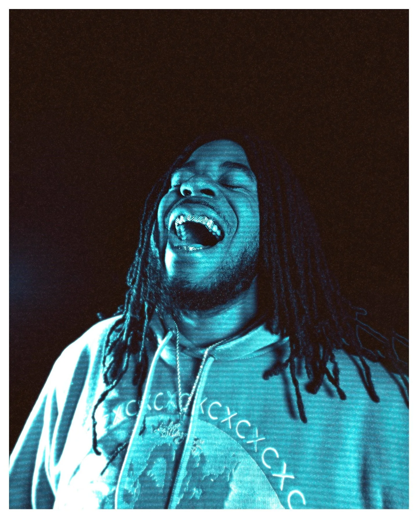
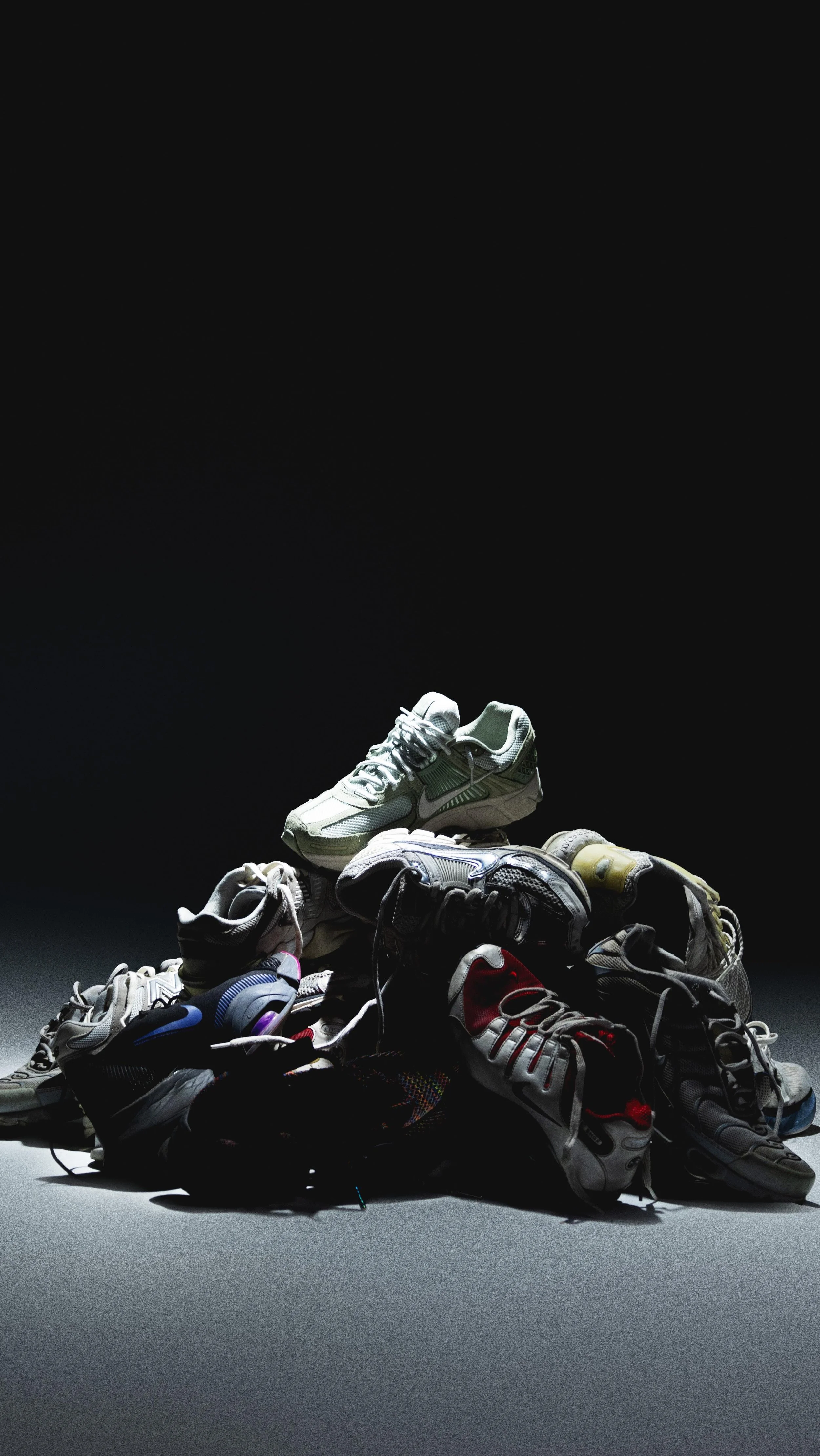
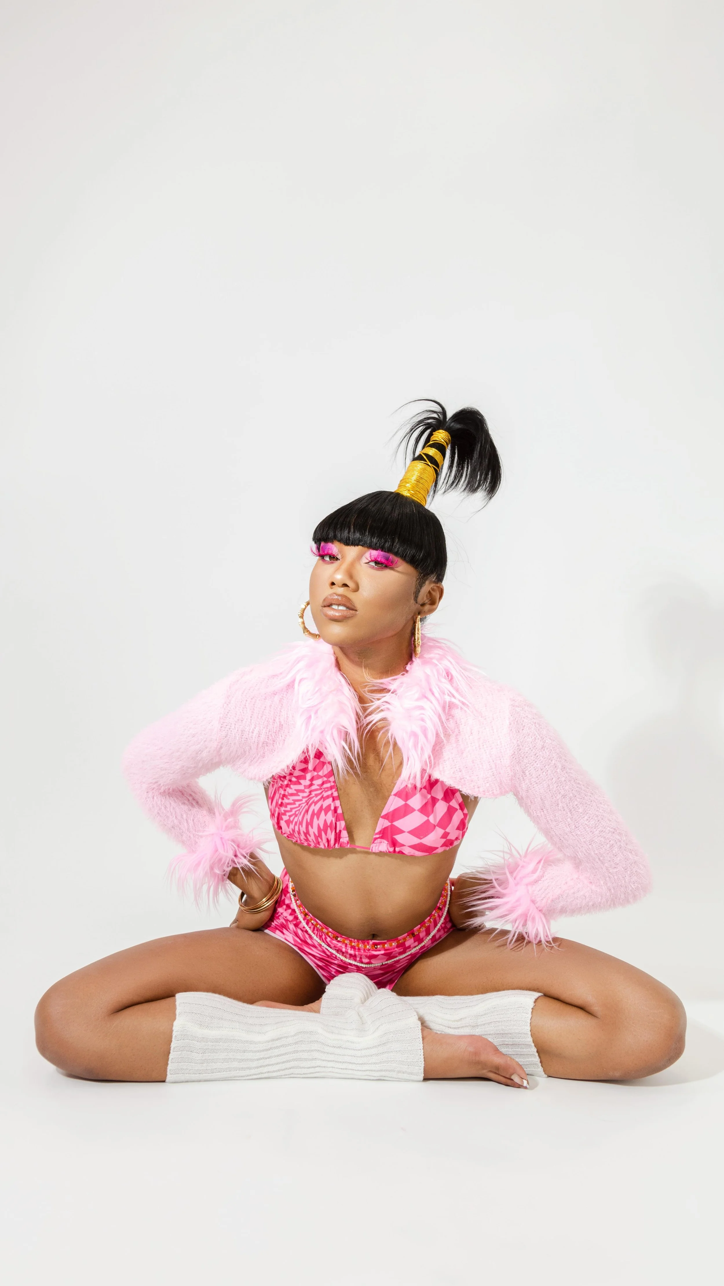

The 5 foundational photo types that separate brands people scroll past from ones they remember. Real examples, strategic insight, clear ROI.